
• FluTrackers.com Inc. does not provide medical advice. Information on this web site is collected from various internet resources, and the FluTrackers board of directors makes no warranty to the safety, efficacy, correctness or completeness of the information posted on this site by any author or poster. The information collated here is for instructional and/or discussion purposes only and is NOT intended to diagnose or treat any disease, illness, or other medical condition. Every individual reader or poster should seek advice from their personal physician/healthcare practitioner before considering or using any interventions that are discussed on this website. By continuing to access this website you agree to consult your personal physican before using any interventions posted on this website, and you agree to hold harmless FluTrackers.com Inc., the board of directors, the members, and all authors and posters for any effects from use of any medication, supplement, vitamin or other substance, device, intervention, etc. mentioned in posts on this website, or other internet venues referenced in posts on this website.
  • We are not asking for any donations. Do not donate to any entity who says they are raising funds for us.

ISDS-charts

gsgs

Registered User
can we stickify this ?

I think ISDS-charts give the most actual and informative picture
which is available from the outbreak in USA

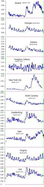
see attachment for expansion.
I think one bar are 2 days , ignore the last bar (being updated...)


(this should be updated automatically ?)

https://isds.cirg.washington.edu/distribute/dailycountstimeseries.php

Boston
daily_counts_fever2.ratio_bphc_15.png


New York
daily_counts_fever2.ratio_nyc_6.png


North Carolina:
daily_counts_fever.ratio_ncdetect_14.png


Utah:
daily_counts_fever.ratio_udh_16.png


expanded last few months in the attachment
 

Attachments

  • isdsg1b.jpg
    isdsg1b.jpg
    80.7 KB · Views: 0
Re: ISDS-charts

Thanks for adding the attachment; it's really helpful to be able to compare them all in one frame.

Interestingly, Georgia, Indiana and N. Carolina appear very similar.

Boston, New York and Utah all have the 2 peaks; Boston and NY are more similar, though.

Kingston, Ontario has a strange pattern, unlike the rest.
 
Re: ISDS-charts

Thanks for adding the attachment; it's really helpful to be able to compare them all in one frame.

Interestingly, Georgie, Indiana and N. Carolina appear very similar.

Boston, New York and Utah all have the 2 peaks; Boston and NY are more similar, though.
It might be interesting to know whether the cities with two peaks have genetically idential strains of the virus. Otherwise, it looks like multiple sources of infection.
 
Re: ISDS-charts

we can assume that NY and Boston are mainly the Cancun-strain.
But all newflu strains should be similar enough as that each one protects
against another one with almost the same intensity.

The two peaks were explained by increased run to the doctors
due to "hype" during the first peak (late April)

But that doesn't seem to explain it all. Maybe also school-closures
or weather
 
Back
Top