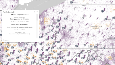
About This Map
To help policy makers, business leaders and the public understand COVID-19 trends, Charlie Frye, Chief Cartographer at Esri, analyzes the week to week changes in active cases. By shifting focus from the highly variable daily changes in active case counts to a weekly perspective, we can see weekly trends emerge. The maps below show data through August 29, 2021.
This arrow map builds on a simple question most people want to know: are things getting better, or worse, in my area? And for how long has it been going this way?
The colored arrow indicates whether new cases of COVID-19 are going upweek to week, or hopefully going down. Purple arrows always point upwards because cases are accelerating. Orange arrows always point down because new cases are slowing down.
snip
-----------------------------
Okieman Comment: Be sure to zoom into the county you are interested in and click on it. An informational popup will give you additional data.
