
• FluTrackers.com Inc. does not provide medical advice. Information on this web site is collected from various internet resources, and the FluTrackers board of directors makes no warranty to the safety, efficacy, correctness or completeness of the information posted on this site by any author or poster. The information collated here is for instructional and/or discussion purposes only and is NOT intended to diagnose or treat any disease, illness, or other medical condition. Every individual reader or poster should seek advice from their personal physician/healthcare practitioner before considering or using any interventions that are discussed on this website. By continuing to access this website you agree to consult your personal physican before using any interventions posted on this website, and you agree to hold harmless FluTrackers.com Inc., the board of directors, the members, and all authors and posters for any effects from use of any medication, supplement, vitamin or other substance, device, intervention, etc. mentioned in posts on this website, or other internet venues referenced in posts on this website.
  • We are not asking for any donations. Do not donate to any entity who says they are raising funds for us.

NYC Mortality Data Through 8/30

JimO

Well-known member
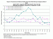
Source: http://www.nyc.gov/html/doh/images/flu/flu-mort-65-large.gif

The following graph is a plot of weekly deaths <65 (3-week moving average) in NYC from April through August from influenza and pneumonia. I'm not sure how to extract an exact count, but I estimate that this represents on the order of 130 - 140 fatilities. During that same period, New York State reported close to 30 confirmed deaths related to H1N1. This appears to be about double what we have been showing on the FT tally.
NYC Mortality.gif
 
Re: NYC Mortality Data Through 8/30

what mans 8/30 in the headline
how do you get 130 deaths
why <65 ? official statistics doesn't have this,
can it be different when you include >65 ?
I mean, ****** can hardly reduce their deaths


http://wonder.cdc.gov/mmwr/mmwr_rep...wr_location=New+York+City,+N.Y.&mmwr_table=4A

weekly deaths from pneumonia and influenza in New York City in 2009, all ages, weeks 01-36:

63,52,60,52,54,53,47,55,43,46,49,45,61,45,33,34,32,44,23,51,30,42,29,46,31,34,36,42,45,37,36,42,25,37,22,33

I can't verify the chart above.


ohno,theblankerror?Softwareincludesblanksinlonglines,madeitimpossibletogetmytablesformattedcorrectlyatCE...
63,52,60,52,54,53,47,55,43,46,49,45,61,45,33,34,32,44,23,51,30,42,29,46,31,34,36,42,45,37,36,42,25,37,22,33
hopefullyit'sonlyinthetextandnotincode--testing---------------------
------------------------------------------------------------------------------------------------
Code:
ohno,theblankerror?Softwareincludesblanksinlonglines,madeitimpossibletogetmytablesformattedcorrectlyatCE...
63,52,60,52,54,53,47,55,43,46,49,45,61,45,33,34,32,44,23,51,30,42,29,46,31,34,36,42,45,37,36,42,25,37,22,33
 
Re: NYC Mortality Data Through 8/30

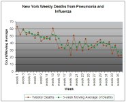
Here is a graph of the weekly and the three-week moving average of deaths in New York City attributed to pneumonia and influenza through week 39 of 2009. Note that the average has been trending down. Data is from the post and link by gsgs above.

NYC deaths by week 20090922.jpg
 
Re: NYC Mortality Data Through 8/30

Note also that the caption in the graph posted by JimO is incorrect. The graph does not compare all deaths between April 18, 2007 through August 29, 2009. Rather, it compares deaths for three, approximately 19-week periods (week 16-week 35) over a three year period (2007, 2008, and 2009). The peak in the graph for 2009 shown on June 27th corresponds to Week 26 in the graph I posted above. The discrepancies between these two graphs is hard to reconcile.
 
Back
Top