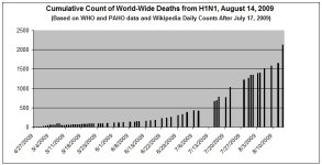
Re: Graph: Cumulative Worldwide Deaths from H1N1 (update August 14, 2009)
Re: Graph: Cumulative Worldwide Deaths from H1N1 (update August 14, 2009)
True. But if a couple lines before it were a little under reported it would make a smoother exponential curve wouldn't it?
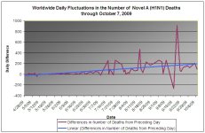
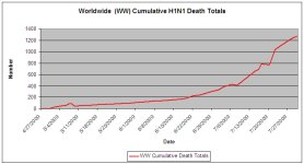
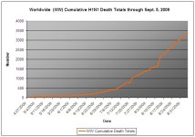
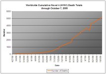
Slithers - the trend is clear. The irregular spikes in the overall counts is due to the fact that I am not updating the data every day. Here is a list of the most recent dates (data points). Because of the small size of the graph the dates without associated data are not always obvious.
<table bgcolor="#ffffff" border="1" cellspacing="0"><thead><tr><th bordercolor="#000000" bgcolor="#c0c0c0">
Report date</th> </tr> </thead> <tbody> <tr valign="TOP"> <td bordercolor="#c0c0c0" align="RIGHT">
7/28/2009</td> </tr> <tr valign="TOP"> <td bordercolor="#c0c0c0" align="RIGHT">
7/30/2009</td> </tr> <tr valign="TOP"> <td bordercolor="#c0c0c0" align="RIGHT">
7/31/2009</td> </tr> <tr valign="TOP"> <td bordercolor="#c0c0c0" align="RIGHT">
8/1/2009</td> </tr> <tr valign="TOP"> <td bordercolor="#c0c0c0" align="RIGHT">
8/3/2009</td> </tr> <tr valign="TOP"> <td bordercolor="#c0c0c0" align="RIGHT">
8/4/2009</td> </tr> <tr valign="TOP"> <td bordercolor="#c0c0c0" align="RIGHT">
8/6/2009</td> </tr> <tr valign="TOP"> <td bordercolor="#c0c0c0" align="RIGHT">
8/9/2009</td> </tr> <tr valign="TOP"> <td bordercolor="#c0c0c0" align="RIGHT">
8/12/2009</td> </tr> <tr valign="TOP"> <td bordercolor="#c0c0c0" align="RIGHT">
8/14/2009</td> </tr> </tbody> <tfoot></tfoot> </table>


 ></o
></o