
gsgs
Registered User
Re: Ebola: Graph - cumulative cases & deaths using WHO updates - October 7, 2014
Re: Ebola: Graph - cumulative cases & deaths using WHO updates - October 7, 2014
> GS your charts need some explanation. What are the axes?
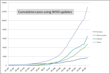
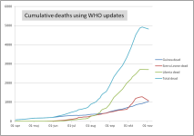
horizontal: time, one mark = 1 week, weeks 34-41 (week 41 ended Oct.12)
vertical: number of cases (confirmed for Guinea and Sierra Leone,confirmed+
suspected+probable for Liberia). The scaling is not added, it's a bit difficult,
because I keep changing it so to fit the charts into the window.
Maybe I can do it later. IMO, it's not so important for seeing the trend
> What periods are being covered. Why so many lines on the MA?
one chart for each of the regions
> If you are using WHO data, they don't have local data, only at
> the country level? Could you explain a little?
I'm using the situation reports and French embassy data for Guinea
> What are you trying to show with these charts?
where the trend goes, how big the danger is of exponential explosion
it was started here: http://thisbluemarble.com/showthread.php?t=59033
and here: http://thisbluemarble.com/showthread.php?t=59642
and here: http://www.flutrackers.com/forum/showthread.php?t=228449
also the threads about Kailahun, how it went down in some regions.
most explanations were posted earlier, so I don't repeat them each time.
But, right, I should have at least one post with all the explanations
so I can link to it.
maybe later ... (I'll update here)
Re: Ebola: Graph - cumulative cases & deaths using WHO updates - October 7, 2014
> GS your charts need some explanation. What are the axes?
horizontal: time, one mark = 1 week, weeks 34-41 (week 41 ended Oct.12)
vertical: number of cases (confirmed for Guinea and Sierra Leone,confirmed+
suspected+probable for Liberia). The scaling is not added, it's a bit difficult,
because I keep changing it so to fit the charts into the window.
Maybe I can do it later. IMO, it's not so important for seeing the trend
> What periods are being covered. Why so many lines on the MA?
one chart for each of the regions
> If you are using WHO data, they don't have local data, only at
> the country level? Could you explain a little?
I'm using the situation reports and French embassy data for Guinea
> What are you trying to show with these charts?
where the trend goes, how big the danger is of exponential explosion
it was started here: http://thisbluemarble.com/showthread.php?t=59033
and here: http://thisbluemarble.com/showthread.php?t=59642
and here: http://www.flutrackers.com/forum/showthread.php?t=228449
also the threads about Kailahun, how it went down in some regions.
most explanations were posted earlier, so I don't repeat them each time.
But, right, I should have at least one post with all the explanations
so I can link to it.
maybe later ... (I'll update here)