

Install the app
How to install the app on iOS
Follow along with the video below to see how to install our site as a web app on your home screen.
Note: This feature may not be available in some browsers.
-
FluTrackers.com Inc. does not provide medical advice. Information on this web site is collected from various internet resources, and the FluTrackers board of directors makes no warranty to the safety, efficacy, correctness or completeness of the information posted on this site by any author or poster. The information collated here is for instructional and/or discussion purposes only and is NOT intended to diagnose or treat any disease, illness, or other medical condition. Every individual reader or poster should seek advice from their personal physician/healthcare practitioner before considering or using any interventions that are discussed on this website. By continuing to access this website you agree to consult your personal physican before using any interventions posted on this website, and you agree to hold harmless FluTrackers.com Inc., the board of directors, the members, and all authors and posters for any effects from use of any medication, supplement, vitamin or other substance, device, intervention, etc. mentioned in posts on this website, or other internet venues referenced in posts on this website. -
We are not asking for any donations. Do not donate to any entity who says they are raising funds for us.
You are using an out of date browser. It may not display this or other websites correctly.
You should upgrade or use an alternative browser.
You should upgrade or use an alternative browser.
Ebola: Graph - cumulative cases & deaths using WHO updates - November 6, 2014
- Thread starter Nordica
- Start date
Nordica
Well-known member
Re: Ebola: Graph - cumulative cases & deaths using WHO updates - August 11, 2014
Re: Ebola: Graph - cumulative cases & deaths using WHO updates - August 11, 2014
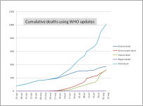
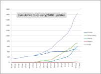
Source WHO Ebola updates - 11 August 2014
http://www.who.int/csr/don/archive/disease/ebola/en/
Re: Ebola: Graph - cumulative cases & deaths using WHO updates - August 11, 2014
Source WHO Ebola updates - 11 August 2014
http://www.who.int/csr/don/archive/disease/ebola/en/
Re: Ebola: Graph - cumulative cases & deaths using WHO updates - August 11, 2014
Re: Ebola: Graph - cumulative cases & deaths using WHO updates - August 11, 2014
Interesting.
Guinea's numbers look strange.
The infection rate is relatively low, with the death rate relatively high. The curve looks wrong compared to the others. It is much much flatter.
And actually, going by the curves themselves, it seems that the infection rate and death rate accelerate with each new country.
Anyone else seeing that?
Example, Liberia, despite having started about 2 weeks after SL, appears to have just passed it in deaths.
Additionally it appears SL took 12 weeks to make 600 infected, and Liberia reached that in about 10.
Re: Ebola: Graph - cumulative cases & deaths using WHO updates - August 11, 2014
Interesting.
Guinea's numbers look strange.
The infection rate is relatively low, with the death rate relatively high. The curve looks wrong compared to the others. It is much much flatter.
And actually, going by the curves themselves, it seems that the infection rate and death rate accelerate with each new country.
Anyone else seeing that?
Example, Liberia, despite having started about 2 weeks after SL, appears to have just passed it in deaths.
Additionally it appears SL took 12 weeks to make 600 infected, and Liberia reached that in about 10.
Nordica
Well-known member
Re: Ebola: Graph - cumulative cases & deaths using WHO updates - August 11, 2014
Re: Ebola: Graph - cumulative cases & deaths using WHO updates - August 11, 2014
Yes Guinea looks strange due to that the number decrease in the WHO report, I guess that is because they have corrected wrong reporting. (Compare WHO July 1st update with July 15th)
The mortality is very different between the countries:
Guinea 74 %, Sierra Leone 43% and Liberia 54%, Total 55%.
I also wonder why, maybe due to different reporting in the different countries.
Re: Ebola: Graph - cumulative cases & deaths using WHO updates - August 11, 2014
Interesting.
Guinea's numbers look strange.
The infection rate is relatively low, with the death rate relatively high. The curve looks wrong compared to the others. It is much much flatter.
And actually, going by the curves themselves, it seems that the infection rate and death rate accelerate with each new country.
Anyone else seeing that?
Example, Liberia, despite having started about 2 weeks after SL, appears to have just passed it in deaths.
Additionally it appears SL took 12 weeks to make 600 infected, and Liberia reached that in about 10.
Yes Guinea looks strange due to that the number decrease in the WHO report, I guess that is because they have corrected wrong reporting. (Compare WHO July 1st update with July 15th)
The mortality is very different between the countries:
Guinea 74 %, Sierra Leone 43% and Liberia 54%, Total 55%.
I also wonder why, maybe due to different reporting in the different countries.
Re: Ebola: Graph - cumulative cases & deaths using WHO updates - August 11, 2014
Re: Ebola: Graph - cumulative cases & deaths using WHO updates - August 11, 2014
I can think of a few reasons for the discrepancy in CFR. Liberia and Sierra Leone both appear to have significant numbers of fatal cases that are not in the reporting at all because they did not seek medical attention but died at home or in the streets. Both of those countries also have a large number of recent cases, who may still be ill (and some of them will die).
Guinea, by contrast, has very few actively ill cases (perhaps fewer than 20 in the entire country), and very few recent cases (11 total in the period from August 5-9), so they seem to be reporting a more accurate CFR.
I think the shorter outbreak time in Liberia and Sierra Leone might also have resulted in the inclusion in the probable and suspected categories of cases that are not in fact Ebola, and would therefore have a lower CFR.
Re: Ebola: Graph - cumulative cases & deaths using WHO updates - August 11, 2014
I can think of a few reasons for the discrepancy in CFR. Liberia and Sierra Leone both appear to have significant numbers of fatal cases that are not in the reporting at all because they did not seek medical attention but died at home or in the streets. Both of those countries also have a large number of recent cases, who may still be ill (and some of them will die).
Guinea, by contrast, has very few actively ill cases (perhaps fewer than 20 in the entire country), and very few recent cases (11 total in the period from August 5-9), so they seem to be reporting a more accurate CFR.
I think the shorter outbreak time in Liberia and Sierra Leone might also have resulted in the inclusion in the probable and suspected categories of cases that are not in fact Ebola, and would therefore have a lower CFR.
Re: Ebola: Graph - cumulative cases & deaths using WHO updates - August 11, 2014
Re: Ebola: Graph - cumulative cases & deaths using WHO updates - August 11, 2014
There's an interesting article about the CFR here:
http://epidemic.bio.ed.ac.uk/ebolavirus_fatality_rate
Basically, it's pretty unreliable at this stage given the inconsistencies in testing methods and the spate of recent cases.
Re: Ebola: Graph - cumulative cases & deaths using WHO updates - August 11, 2014
There's an interesting article about the CFR here:
http://epidemic.bio.ed.ac.uk/ebolavirus_fatality_rate
Basically, it's pretty unreliable at this stage given the inconsistencies in testing methods and the spate of recent cases.
Nordica
Well-known member
Re: Ebola: Graph - cumulative cases & deaths using WHO updates - August 13, 2014
Re: Ebola: Graph - cumulative cases & deaths using WHO updates - August 13, 2014
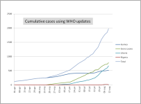
Source: WHO ebola updates - 13 August 2014
http://www.who.int/csr/don/archive/disease/ebola/en/
Re: Ebola: Graph - cumulative cases & deaths using WHO updates - August 13, 2014
Source: WHO ebola updates - 13 August 2014
http://www.who.int/csr/don/archive/disease/ebola/en/
Nordica
Well-known member
Re: Ebola: Graph - cumulative cases & deaths using WHO updates - August 13, 2014
Re: Ebola: Graph - cumulative cases & deaths using WHO updates - August 13, 2014
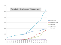
Source: WHO ebola updates - 13 August 2014
http://www.who.int/csr/don/archive/disease/ebola/en/
Re: Ebola: Graph - cumulative cases & deaths using WHO updates - August 13, 2014
Source: WHO ebola updates - 13 August 2014
http://www.who.int/csr/don/archive/disease/ebola/en/

JimO
Well-known member
Re: Ebola: Graph - cumulative cases & deaths using WHO updates - August 13, 2014
Re: Ebola: Graph - cumulative cases & deaths using WHO updates - August 13, 2014
I am a bit concerned about Guinea. I believe they were on the verge of extinguishing the outbreak in late June to early July. They reported 303 deaths through June 30th and only an additional 11 deaths between June 30th and July 23rd. Liberia and SL started reporting significant deaths in mid June, and then the NGOs started pulling out. Guinea then reported the following new deaths:
7/27 - 20 (avg. 5 per day)
7/30 - 7 (2.3 per day)
8/01 - 12 (6 per day)
8/04 - 5 (1.7 per day)
8/06 - 4 (2 per day)
8/09 - 6 (2 per day)
8/11 - 4 (2 per day)
So, they were reporting an average of one death every two days in the first three weeks of July after the outbreak appeared to be nearly over. Then after the attention shifted to Liberia and SL, the death rate has increased to more than two deaths per day since then.
Early in any ebola outbreak, losing two patients per day and continuing to have new cases weekly after more than six months would be a serious concern. I think there is a potential for things to still get out of control in Guinea if their situation is overshadowed by the disasters in Liberia and SL. I hope they have things well in hand, but with new cases appearing weekly, they still need help and I am concerned they won't get it.
Re: Ebola: Graph - cumulative cases & deaths using WHO updates - August 13, 2014
I am a bit concerned about Guinea. I believe they were on the verge of extinguishing the outbreak in late June to early July. They reported 303 deaths through June 30th and only an additional 11 deaths between June 30th and July 23rd. Liberia and SL started reporting significant deaths in mid June, and then the NGOs started pulling out. Guinea then reported the following new deaths:
7/27 - 20 (avg. 5 per day)
7/30 - 7 (2.3 per day)
8/01 - 12 (6 per day)
8/04 - 5 (1.7 per day)
8/06 - 4 (2 per day)
8/09 - 6 (2 per day)
8/11 - 4 (2 per day)
So, they were reporting an average of one death every two days in the first three weeks of July after the outbreak appeared to be nearly over. Then after the attention shifted to Liberia and SL, the death rate has increased to more than two deaths per day since then.
Early in any ebola outbreak, losing two patients per day and continuing to have new cases weekly after more than six months would be a serious concern. I think there is a potential for things to still get out of control in Guinea if their situation is overshadowed by the disasters in Liberia and SL. I hope they have things well in hand, but with new cases appearing weekly, they still need help and I am concerned they won't get it.
JimO
Well-known member
Re: Ebola: Graph - cumulative cases & deaths using WHO updates - August 13, 2014
Re: Ebola: Graph - cumulative cases & deaths using WHO updates - August 13, 2014
I should have also pointed out that Guinea reported 40 new cases between July 27th and August 11th, an average of nearly 3 new cases every day.
Re: Ebola: Graph - cumulative cases & deaths using WHO updates - August 13, 2014
I should have also pointed out that Guinea reported 40 new cases between July 27th and August 11th, an average of nearly 3 new cases every day.
Nordica
Well-known member
Re: Ebola: Graph - cumulative cases & deaths using WHO updates - August 15, 2014
Re: Ebola: Graph - cumulative cases & deaths using WHO updates - August 15, 2014
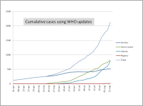
Source: WHO ebola updates - 15 August 2014
http://www.who.int/csr/don/archive/disease/ebola/en/
Re: Ebola: Graph - cumulative cases & deaths using WHO updates - August 15, 2014
Source: WHO ebola updates - 15 August 2014
http://www.who.int/csr/don/archive/disease/ebola/en/
Nordica
Well-known member
Re: Ebola: Graph - cumulative cases & deaths using WHO updates - August 15, 2014
Re: Ebola: Graph - cumulative cases & deaths using WHO updates - August 15, 2014
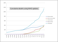
Source: WHO ebola updates - 15 August 2014
http://www.who.int/csr/don/archive/disease/ebola/en/
Re: Ebola: Graph - cumulative cases & deaths using WHO updates - August 15, 2014
Source: WHO ebola updates - 15 August 2014
http://www.who.int/csr/don/archive/disease/ebola/en/
Nordica
Well-known member
Re: Ebola: Graph - cumulative cases & deaths using WHO updates - August 19, 2014
Re: Ebola: Graph - cumulative cases & deaths using WHO updates - August 19, 2014
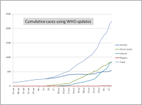
Source WHO Ebola updates - 19 August 2014
http://www.who.int/csr/don/archive/disease/ebola/en/
Re: Ebola: Graph - cumulative cases & deaths using WHO updates - August 19, 2014
Source WHO Ebola updates - 19 August 2014
http://www.who.int/csr/don/archive/disease/ebola/en/
Nordica
Well-known member
Re: Ebola: Graph - cumulative cases & deaths using WHO updates - August 19, 2014
Re: Ebola: Graph - cumulative cases & deaths using WHO updates - August 19, 2014
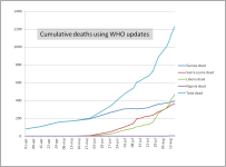
Source WHO Ebola updates - 19 August 2014
http://www.who.int/csr/don/archive/disease/ebola/en/
Re: Ebola: Graph - cumulative cases & deaths using WHO updates - August 19, 2014
Source WHO Ebola updates - 19 August 2014
http://www.who.int/csr/don/archive/disease/ebola/en/
JimO
Well-known member
Re: Ebola: Graph - cumulative cases & deaths using WHO updates - August 19, 2014
Re: Ebola: Graph - cumulative cases & deaths using WHO updates - August 19, 2014
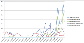
I thought it might be useful to look at the average deaths reported per day based on the WHO reports. This might not be the best representation of the data, but I simply took the number of deaths reported and divided by the days that the report covered.
Re: Ebola: Graph - cumulative cases & deaths using WHO updates - August 19, 2014
I thought it might be useful to look at the average deaths reported per day based on the WHO reports. This might not be the best representation of the data, but I simply took the number of deaths reported and divided by the days that the report covered.
Nordica
Well-known member
Re: Ebola: Graph - cumulative cases & deaths using WHO updates - August 22, 2014
Re: Ebola: Graph - cumulative cases & deaths using WHO updates - August 22, 2014
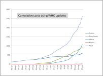
Source WHO Ebola updates - 22 August 2014
http://www.afro.who.int/en/clusters...virus-disease-west-africa-22-august-2014.html
Re: Ebola: Graph - cumulative cases & deaths using WHO updates - August 22, 2014
Source WHO Ebola updates - 22 August 2014
http://www.afro.who.int/en/clusters...virus-disease-west-africa-22-august-2014.html
Nordica
Well-known member
Re: Ebola: Graph - cumulative cases & deaths using WHO updates - August 22, 2014
Re: Ebola: Graph - cumulative cases & deaths using WHO updates - August 22, 2014
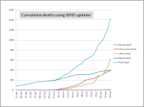
Source WHO Ebola updates - 22 August 2014
http://www.afro.who.int/en/clusters...virus-disease-west-africa-22-august-2014.html
Re: Ebola: Graph - cumulative cases & deaths using WHO updates - August 22, 2014
Source WHO Ebola updates - 22 August 2014
http://www.afro.who.int/en/clusters...virus-disease-west-africa-22-august-2014.html
Re: Ebola: Graph - cumulative cases & deaths using WHO updates - August 22, 2014
Re: Ebola: Graph - cumulative cases & deaths using WHO updates - August 22, 2014
Man,
ether Liberia's reporting is alot better, or something is really bad wrong there.
Guinea's number still look wrong too.
Re: Ebola: Graph - cumulative cases & deaths using WHO updates - August 22, 2014
Man,
ether Liberia's reporting is alot better, or something is really bad wrong there.
Guinea's number still look wrong too.
Re: Ebola: Graph - cumulative cases & deaths using WHO updates - August 22, 2014
Re: Ebola: Graph - cumulative cases & deaths using WHO updates - August 22, 2014
The deaths curve is still exponential, and the doubling time for death rate may be accelerating:
~190 on 23 May
~400 on 24 June
660 on 23 July
1427 on 22 Aug
Assuming an ongoing doubling time of a month would mean:
3124 on 22 Sep
6248 on 22 Oct
12496 on 22 Nov
24992 on 22 Dec
Not a pleasant thought, especially when combined with the fact that we know the reported statistics are low.
Re: Ebola: Graph - cumulative cases & deaths using WHO updates - August 22, 2014
The deaths curve is still exponential, and the doubling time for death rate may be accelerating:
~190 on 23 May
~400 on 24 June
660 on 23 July
1427 on 22 Aug
Assuming an ongoing doubling time of a month would mean:
3124 on 22 Sep
6248 on 22 Oct
12496 on 22 Nov
24992 on 22 Dec
Not a pleasant thought, especially when combined with the fact that we know the reported statistics are low.
Nordica
Well-known member
Re: Ebola: Graph - cumulative cases & deaths using WHO updates - August 28, 2014
Re: Ebola: Graph - cumulative cases & deaths using WHO updates - August 28, 2014
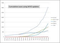
Source WHO Ebola updates - 28 August 2014
http://www.who.int/csr/don/2014_08_28_ebola/en/
Re: Ebola: Graph - cumulative cases & deaths using WHO updates - August 28, 2014
Source WHO Ebola updates - 28 August 2014
http://www.who.int/csr/don/2014_08_28_ebola/en/